
Guillermo Del Toro’s Cabinet of Curiosities - Title Sequence
DIRECTOR
currently nominated for a 2023 Emmy® Award for Outstanding Title Design
2023 Motion Graphics and Design Award Winner, Association of Independent Commercial Producers
learn more at Art of the Title
Cabinet of Curiosities collects eight horror short stories under Guillermo Del Toro’s curation—everything from 90-year-old Lovecraft classics to original screenplays written for the series—with each told by a different horror director.

The title sequence imagines somewhere that could house all these dark stories and countless others. Its doorways and halls create a series of Möbius strips in constant flux, freed from laws of our world and driven by their own subconscious instincts.
Appearances to the contrary, it’s not a place one can simply visit. This collection collects you.

At the start I knew almost nothing about the series but still had a huge treasure trove of sources to work from. Del Toro has shared so much in his filmography and through his Bleak House book and exhibition. Add to that the entire problematic history and contents of actual Cabinets of Curiosity dating back to the 16th century, and the possibilities are endless.

From the beginning I knew this was a one way trip: the viewer would be overwhelmed, shrunk down, and transported through the collection by the Faustian darkness that animates the Cabinet.
This journey parallels the characters of the series who are undone by their transgressions in search of the forbidden.

The ending image of the Cabinet doors closing to create a vertical horizon was one of my earliest concepts. In the beginning I created tons of photo comps to explore what combinations of curiosities resonate with one another and how to best display them.


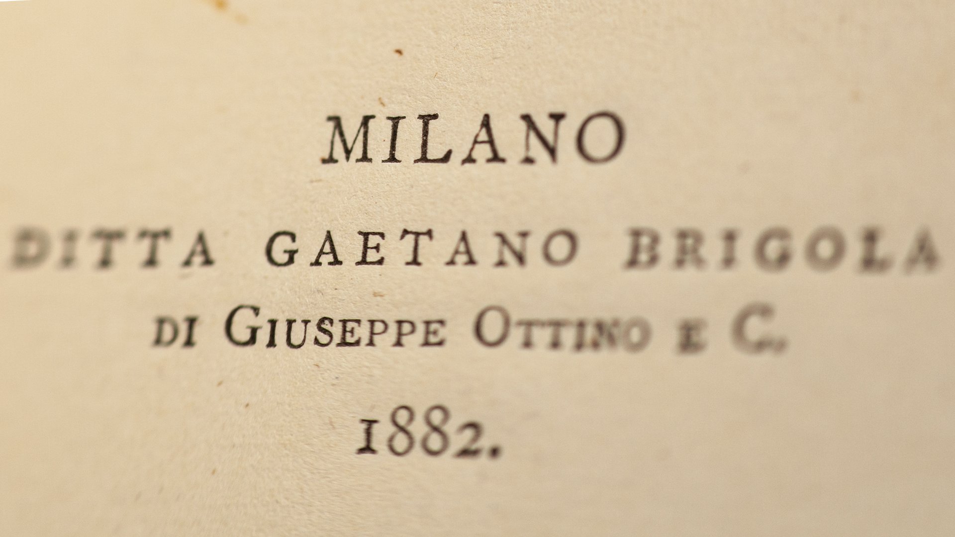
Given that cabinets of curiosity started out over 400 years ago, It was important to use typography with a sense of that history.
The typefaces for the cast and crew titles were inspired by a 1523 writing manual for a Roman classic alphabet and a typeface from Oxford University Press dated to 1693.

The logo type has been heavily customized but started out as a Cleveland Type Foundry typeface dating to 1888.

A bound collection of 19th century Italian letterpress chapbooks inspired the filigrees in the final logo and the spine designs created for the books seen inside the Cabinet.


custom book spines I created for the opening and closing scenes
As work progressed the sequence evolved into more of a linear journey where the camera never stops moving. This is a subtle homage to Del Toro’s well-known love for the “Haunted Mansion” ride at Disneyland. It also underscores the theme of transgression as the viewer constantly crosses new thresholds and moves further away from safety into the unknown darkness.

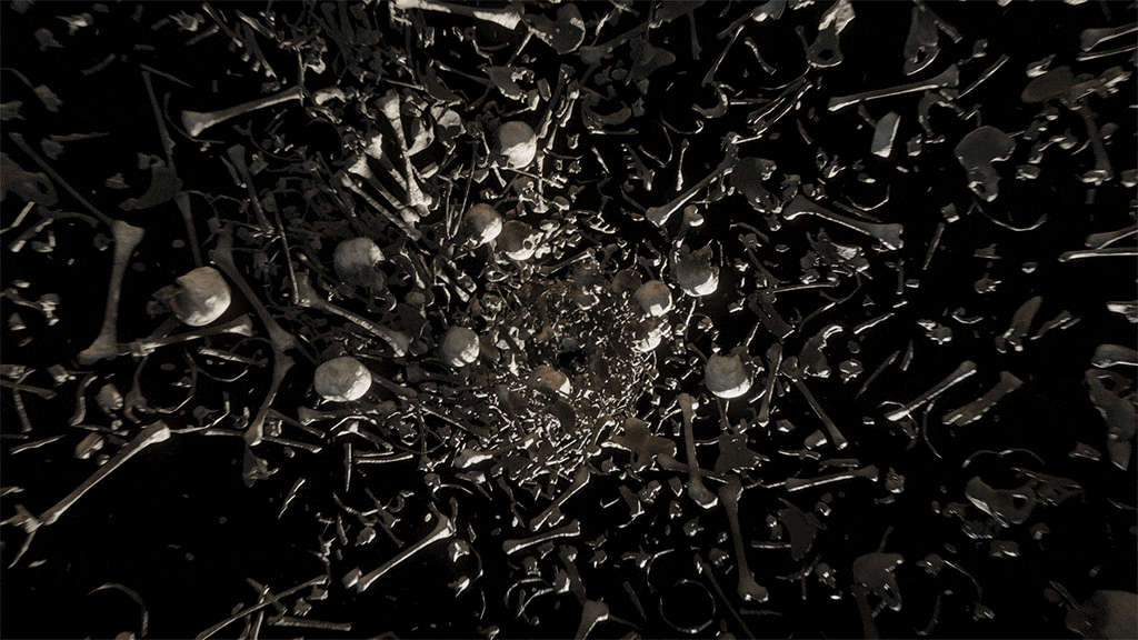
In the end the chaos of this world is returning to order, but the scale is wrong. We see gold leaf designs unfurling and realize we have somehow fallen from the top of a giant row of books.
The light begins to wane and we are drawn backward through doors into darkness.

more detail on our process and workflow for the sequence can be found at Art of The Title.